Let’s talk about website design trends with a question based on your knowledge of the Y2K-era Internet.
Do you remember Geocities?
If the answer is yes—and it probably is, since even those who were kids at the time were subjected to websites on the platform—you remember how broken and clunky it was by today’s standards. Millions of people, including numerous businesses, had their first websites on Geocities because it was the most easily accessible option if you wanted an Internet presence.
In the two decades-plus since Geocities’ inception, websites have evolved dramatically, both in function and style. The life cycle of new site features is short. Sites can be functional but look and feel outdated after just a few years. This means we’ve gone through (depending on how you define them) six or seven generations of websites since that pre-2000 era.
A good site is now an expectation, not a bonus. Sites that are old by the current day’s standards—no matter when the current day is—give the company a sense of being outdated in and of itself. At a certain age, they also start to create conflict with newer web technology, leading to parts of the site breaking for some users even though you haven’t changed anything on the site’s end. And the last thing a business wants is for problems to crop up that make their customers say, “Why don’t they fix this freaking website?!”
With that in mind, it may be time for you to consider a new site design as well.
Design Trends
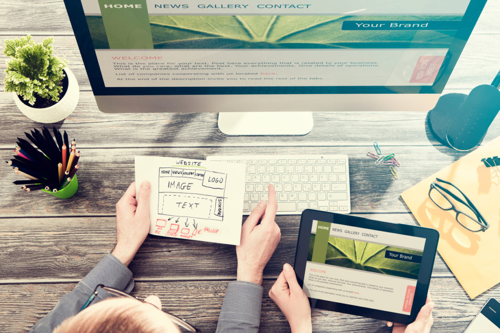
Design trends are mainly based on aesthetics, and we’ll dig into a few that are big this year. Before that, however, remember that the foremost purpose of your business’ website is to possess all the functions your company needs. No matter the exact form, you need a logical roadmap with clear navigation from your home page to every other part of the site, the information about your business most crucial for customers to know, contact information, and security for your site data. You may also need good social media integration, a mobile version of the site, the ability to collect information you can later analyze to better serve customers, or other features relevant to your particular business. No matter the design choices you make with your website creator, they must be able to give you a stable, functional site first.
Once you have that, you need the right look. While your site designer should be able to help determine what’s suitable for your business, it’s good to do some research beforehand and know, at the very least, ideas about which you would like to inquire.
Rounded corners.
This is such a simple idea that if you just hear the term, it feels like you must be missing something. But compare the dialog for composing a tweet to boxes of any type on most sites. Usually, the corners are hard and sharp. Rounded corners are aesthetically more welcoming and easier on the eyes. The change may not seem substantial, but it does more than you might think for something so easy to deploy.
Floating navigation menus.
These certainly existed before 2018, but companies are starting to appreciate and use them more. If you’re unfamiliar with the term, floating navigation menus are those that start as a bar at the top of a page, but rather than stay there and make you scroll back up if you want to use it, the bar moves with you as you scroll down the page. This is especially useful for sites that need a navigation bar but also can make good use of a relatively long main page.
Integrated animations.
This is a little flashier than the first two ideas, but it’s still best used when there’s a specific purpose in mind, rather than trying to animate things by default. Animation gets people’s attention, and if they start watching, they want to see the animation start to finish (even if it loops). That makes it great when used for something very short, such as having something move from one point to another and then stop, leaving attention on its stopping point. It can also find a home on sites where the company wants to tell its story with something a little more interesting than the pure text.
More user interaction.
Tie this one in pretty closely with integrated animations. Having a simple animation that follows the cursor, or reacts to clicks/click-moves, shows a thoughtfulness in design that suggests thoughtfulness in business. This doesn’t have to be a complex idea, either—add a little fun animation to menu dropdowns, a fade-in/out when switching tabs, anything small and eye-catching. Heck, it doesn’t even have to be business-related; letting people toss animated footballs, baseballs, and other bouncy objects around a sporting goods page makes perfect sense and keeps people mentally engaged with your site.
Use data from user interaction to improve lead generation.
Your site needs to sell itself, but people often dislike a too-obvious sales job. Put different interactive bits on different pages of your site and analyze what gets the most traffic. Once you know where people like to go or spend more time, you’ll have a better idea of where to add forms, place calls to action, ask people to subscribe to mailing lists and insert other lead-generating aspects of your site.
There are more elaborate design trends, but it’s often best to keep your attention focused on your needs, and let the designer help with how bold you can be with your wants. So if you’re looking for a website designer or other online marketing help, contact us, and let’s talk about what we can do for you.